Nominee | Communication | 2015
Solothurner Filmtage

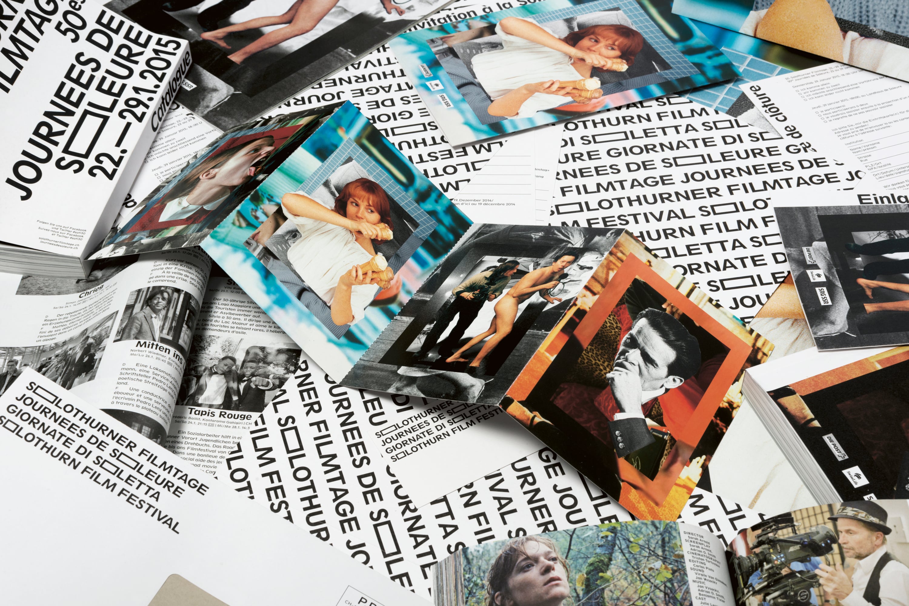
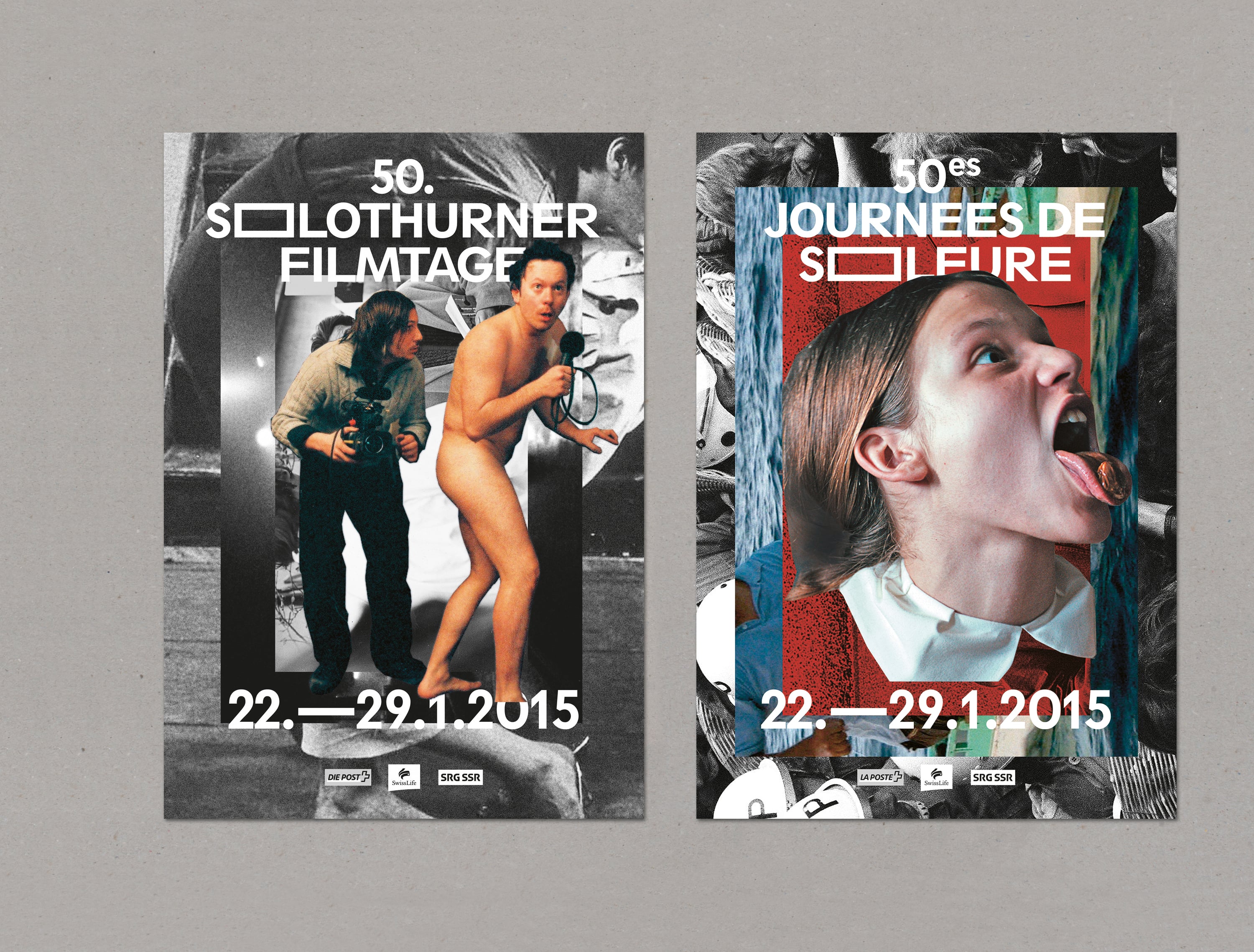
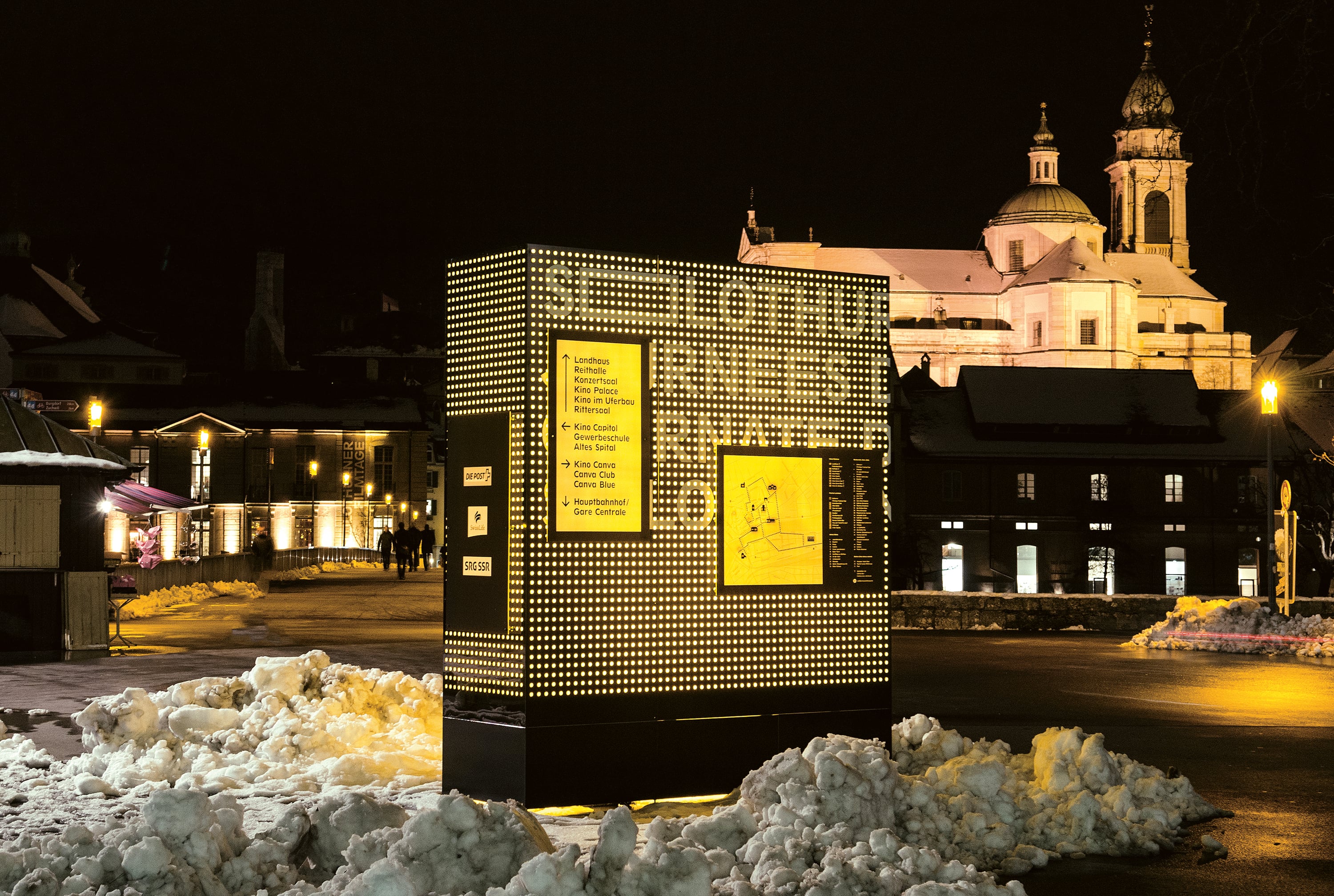
The Solothurn Film Festival is widely regarded as the most important work exhibition and showcase of Swiss film. On the occasion of the 50th anniversary of the festival, which was celebrated at the start of 2015, its visual presentation was radically reworked. The new look has been based on two essential elements – the logo system and the visuals. The basis of the logo consists in the “S” and “O” glyphs. While the S can stand for Switzerland as well as for Solothurn, the rectilinear design of the O can also be read as a character standing for canvas or for “film”. The new pictorial world created for the festival has been designed as a declaration of love for Swiss film. Based on an archive of 50 years of film history, film stills from the most important Swiss productions were selected and superimposed on one another in the form of a collage. Four selected key visuals serve as tags for central communication products such as posters, programme booklets and invitation cards.
Comments of the nominators
The new visual presentation of the film festival is a skilful combination of symbolic and phonetic significance. Notwithstanding the simplicity of the design, it succeeds in communicating a complex message. This is a craftsmanlike and well realised production which deliberately sets its face against short-lived trends.


More projects from edition 2015