Winner | Communication | 2011
Schauspielhaus Zürich 2009/10

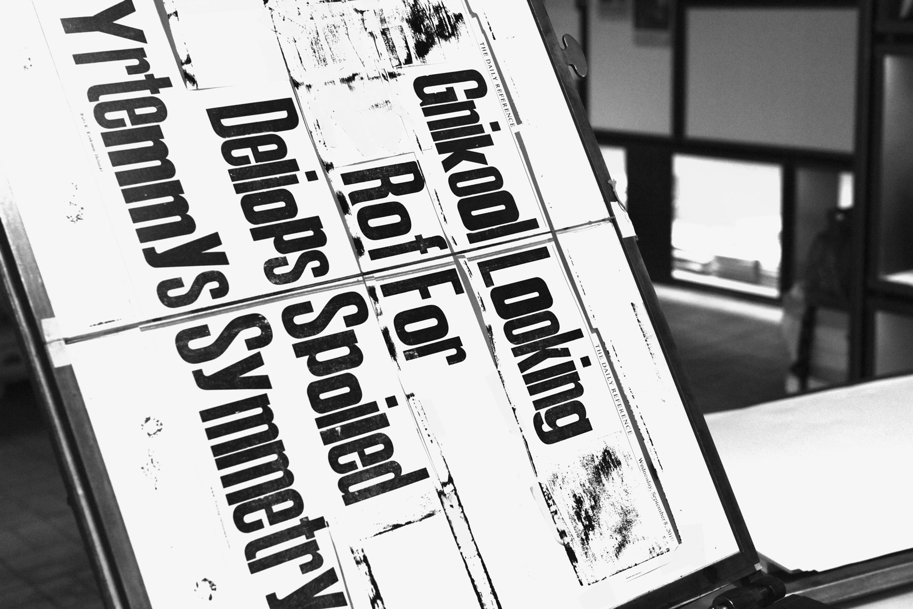
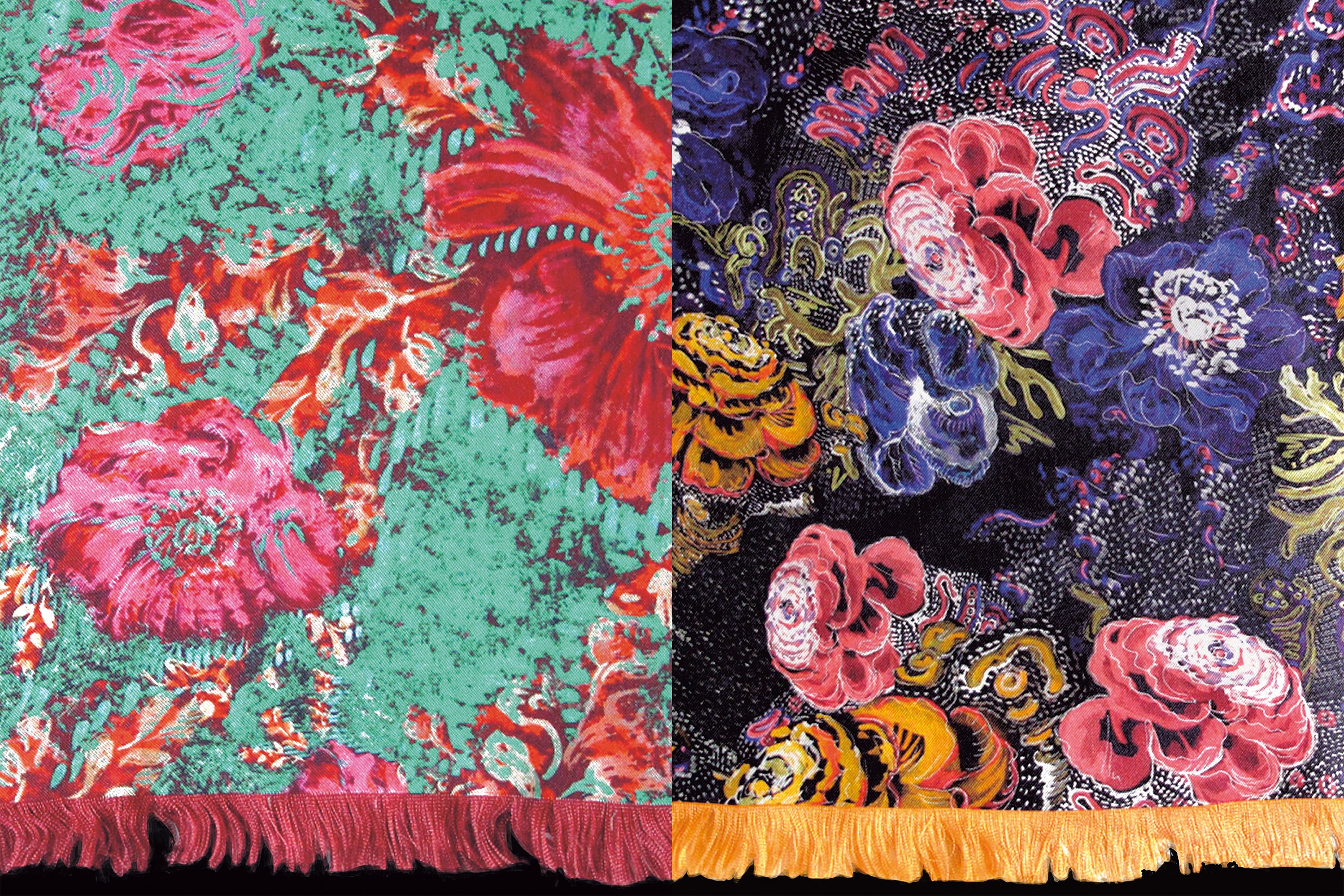
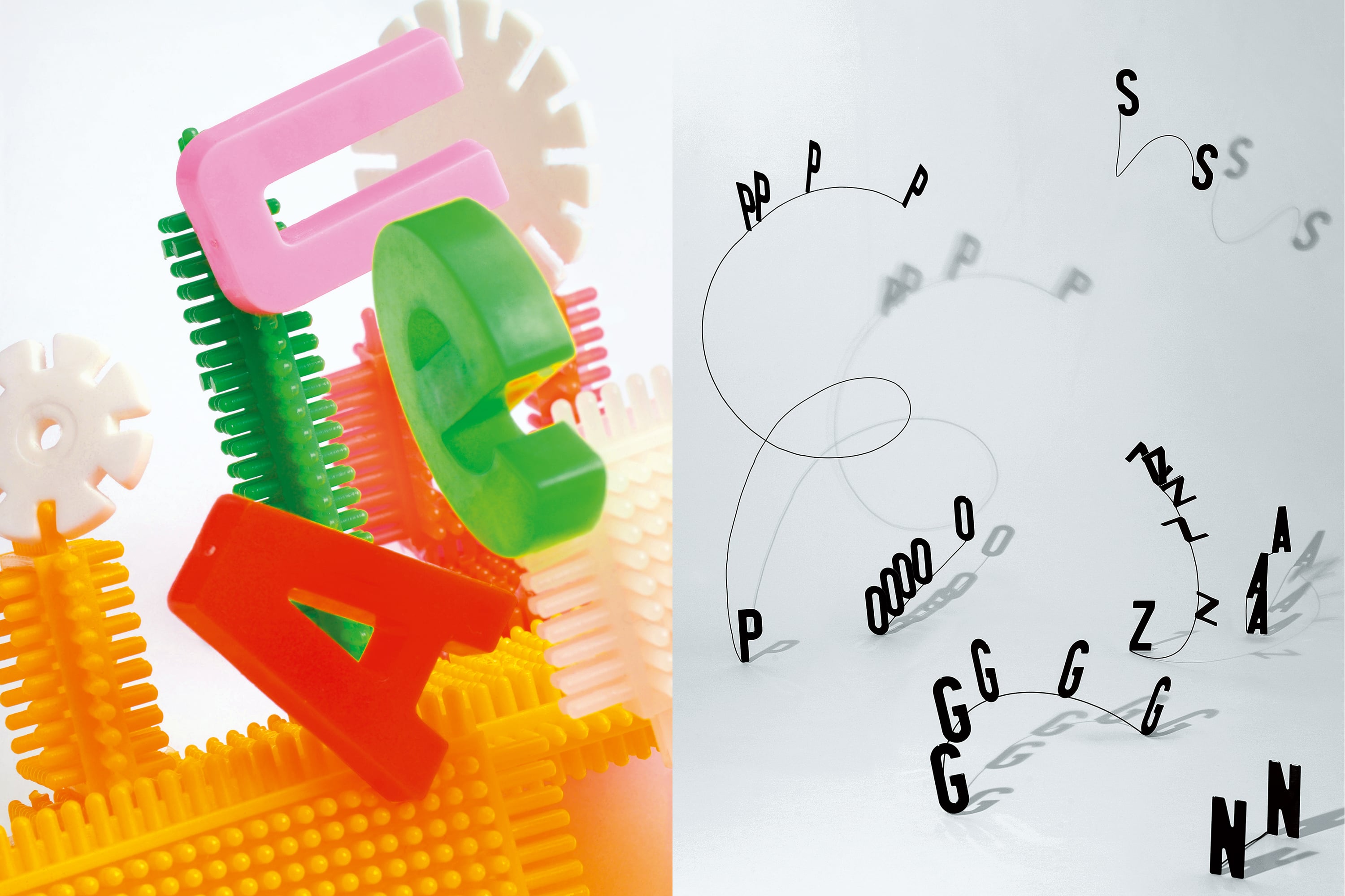
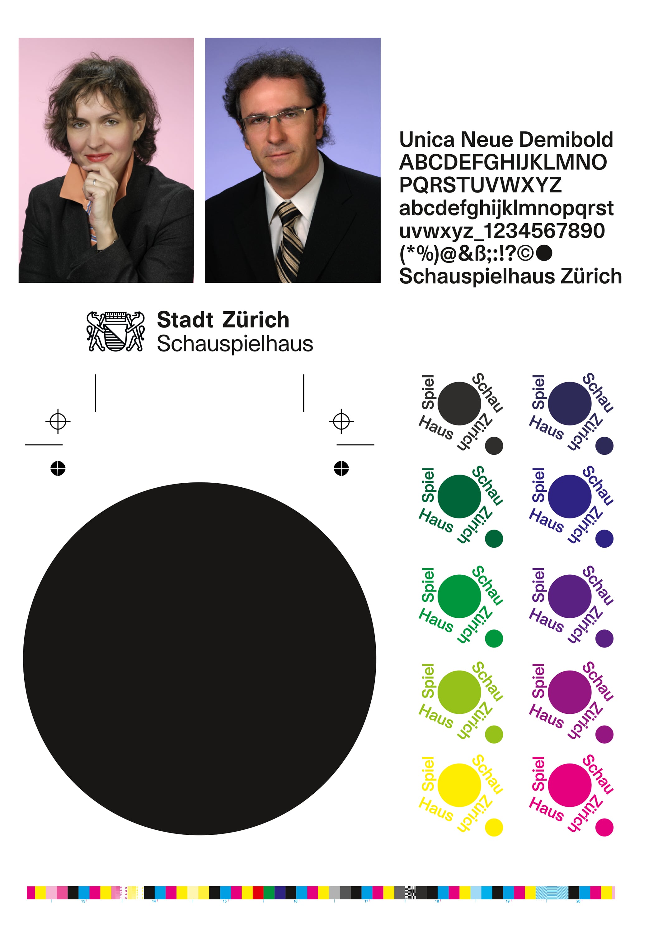
The new visual styling of the Schauspielhaus Zürich (Zurich Playhouse) was developed for the 2009/10 season. It extends over all aspects of the visual impact made by the playhouse, including theatre publicity, the website and the signage. The key graphic element is a black disk, which recurs in a different form in all the various media. The concentrated repertoire of pared-down design features has resulted in a notable economy of design, as well as coherence in terms of the content of the visual products. Besides the minimalist typography – based on the use of just a few sizes of a single font style – and the powerfully reduced colour range in the posters and programmes, the carefully thought out approach to images of differing origin, some invented and some mani-pulated, is of decisive significance.
Comments of the nominators
The visual presentation of the Schauspielhaus Zürich (Zurich Playhouse) covers a wide product range, one that is characterised by radicalism, succinctness and flexibility while retaining a very distinct individuality. The work shows an extreme wealth of imagination, high intelligence and sensitivity in dealing with visual images.
More projects from edition 2011