Nominee | Young Professionals | 2021
Optotype – Interpolation between text and display
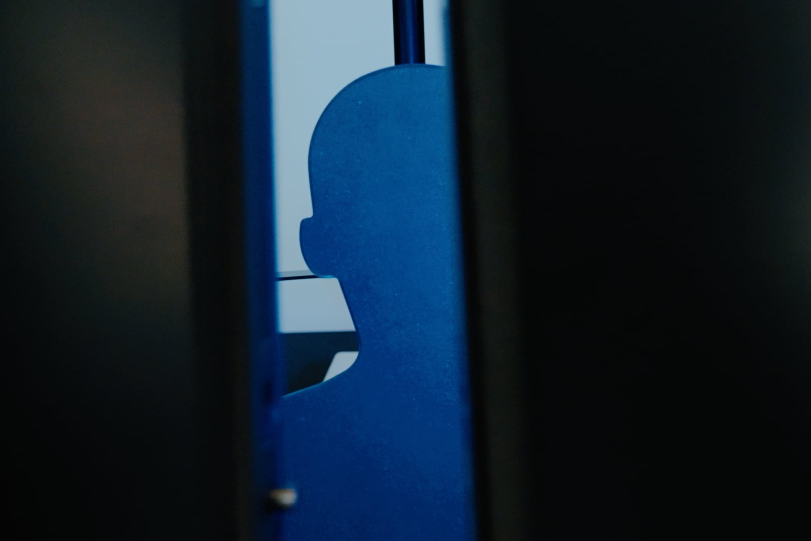
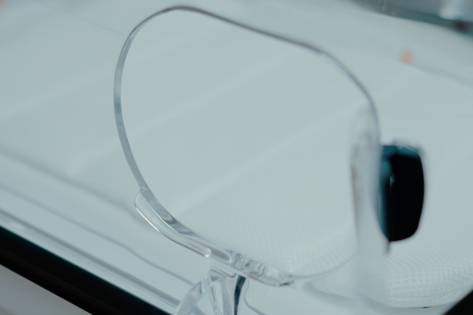
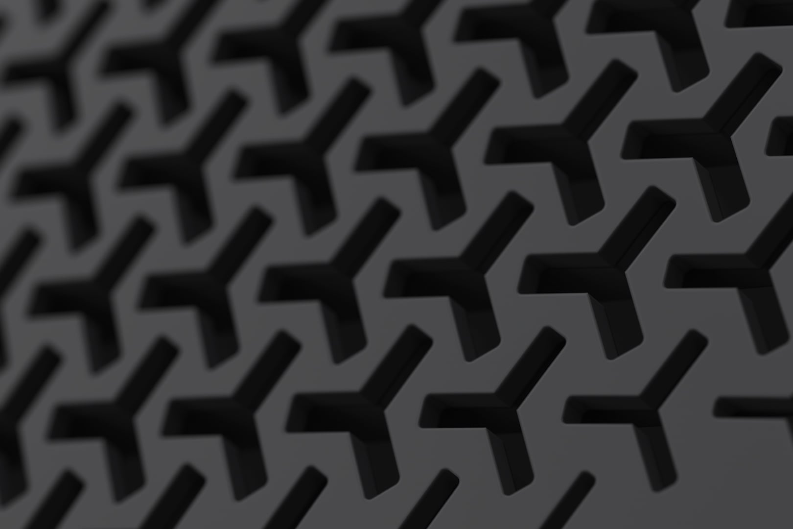
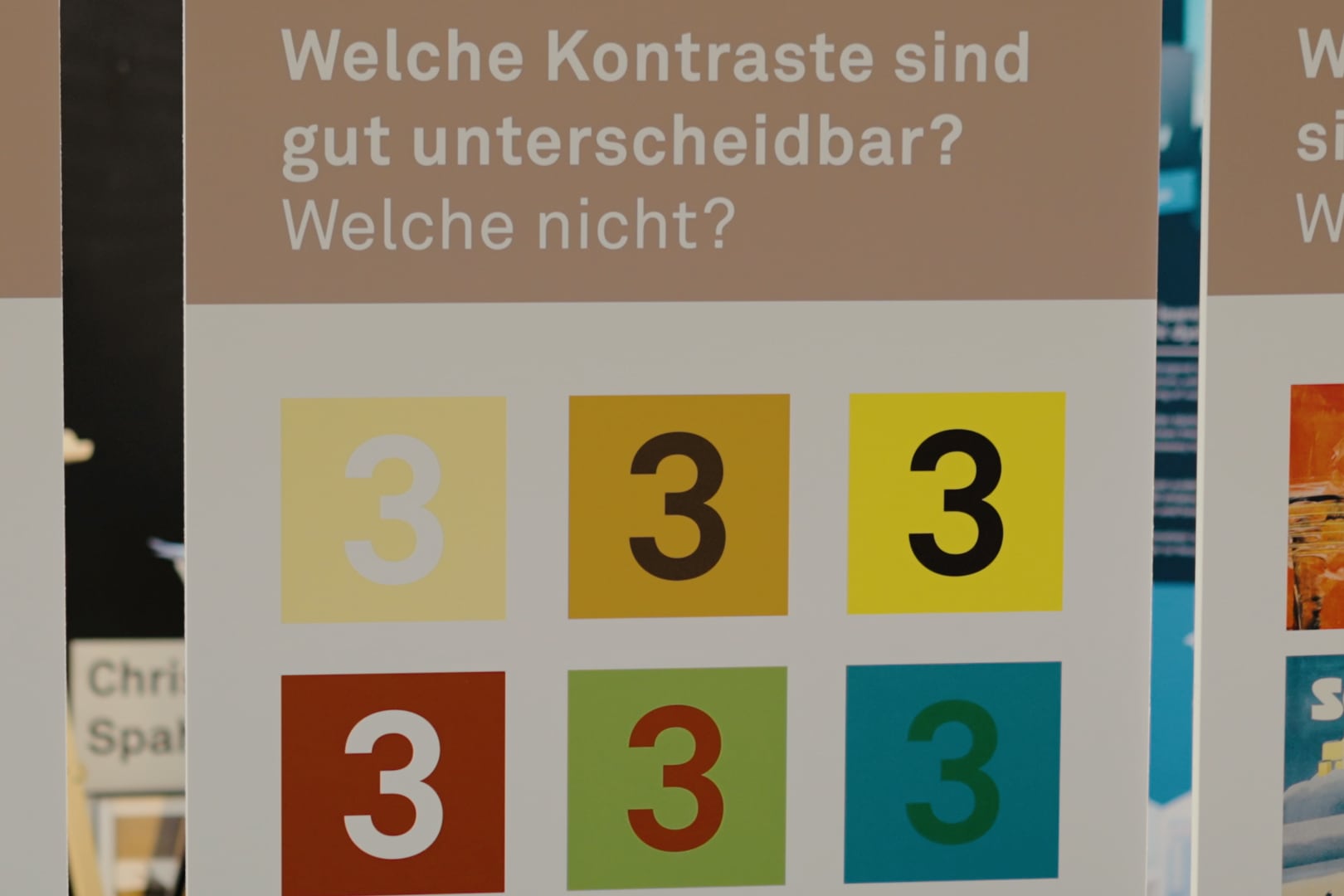
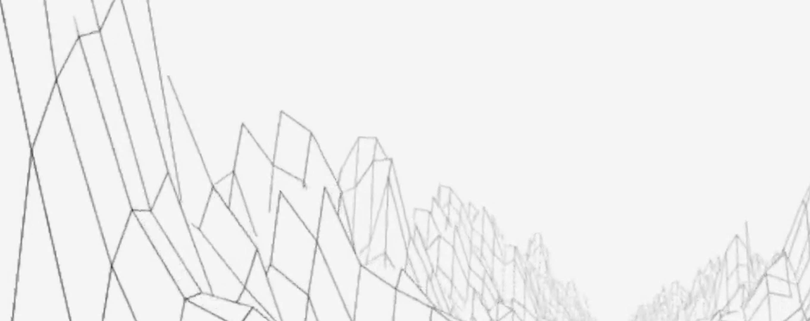
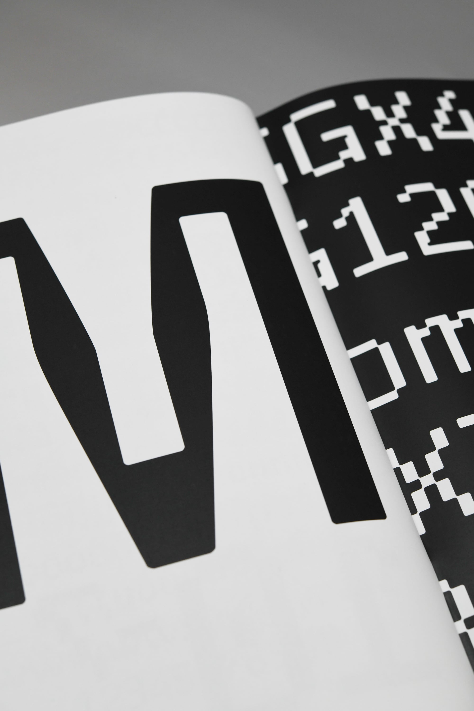
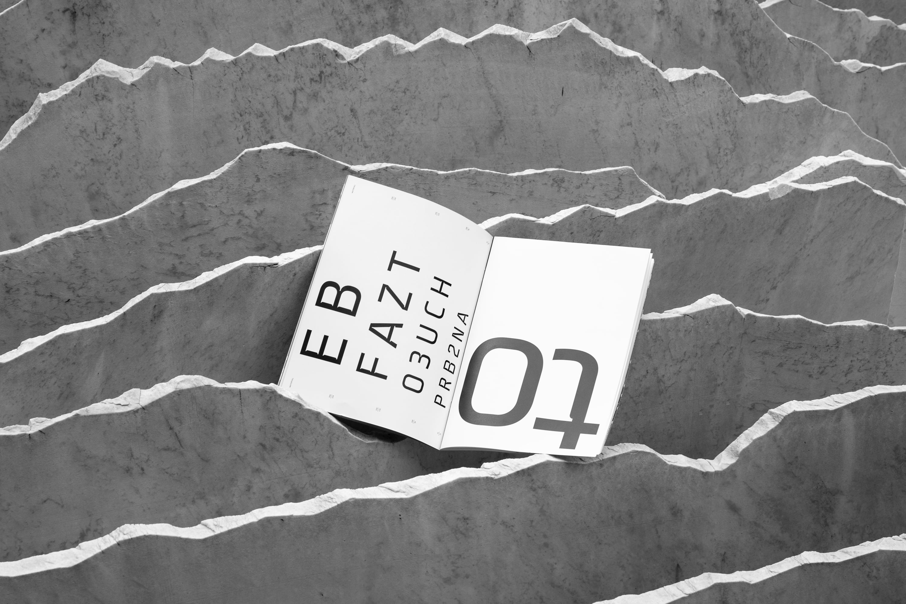
Optotype is a dynamic font whose letters adapt to the resolution of the screen and the distance of the viewer. It was developed as part of a thesis project for the Bachelor in Visual Communication at SUPSI (The University of Applied Sciences and Arts of Southern Switzerland). The goal was to design a changing web font that experimentally addresses the relationship between font shape, screen resolution and reading distance. The starting point of the work was a heavily pixelated screen font, inspired by Wim Crouwel’s digital fonts. The font changes gradually, analogous to the historical development of screens, which have an ever-increasing resolution: From a grid-like font, an organic-looking, detailed typeface emerges that is characterized by good legibility, even when viewed from a distance. When the font is used, camera tracking determines the respective distance of the reader to the screen. A program links the measured values with the corresponding typeface characteristics. In this way, the designer not only explores the limits of legibility, but also shows the public the rapid development of digital type design.
Comments of the nominators
From time to time, we need new typefaces that reflect the changing world and meet new demands. Optotype is a successful typeface development based on a careful form-finding process and distinguished by its user-friendliness.
Comments of the jury

More projects from edition 2021