Nominee | Communication | 2003
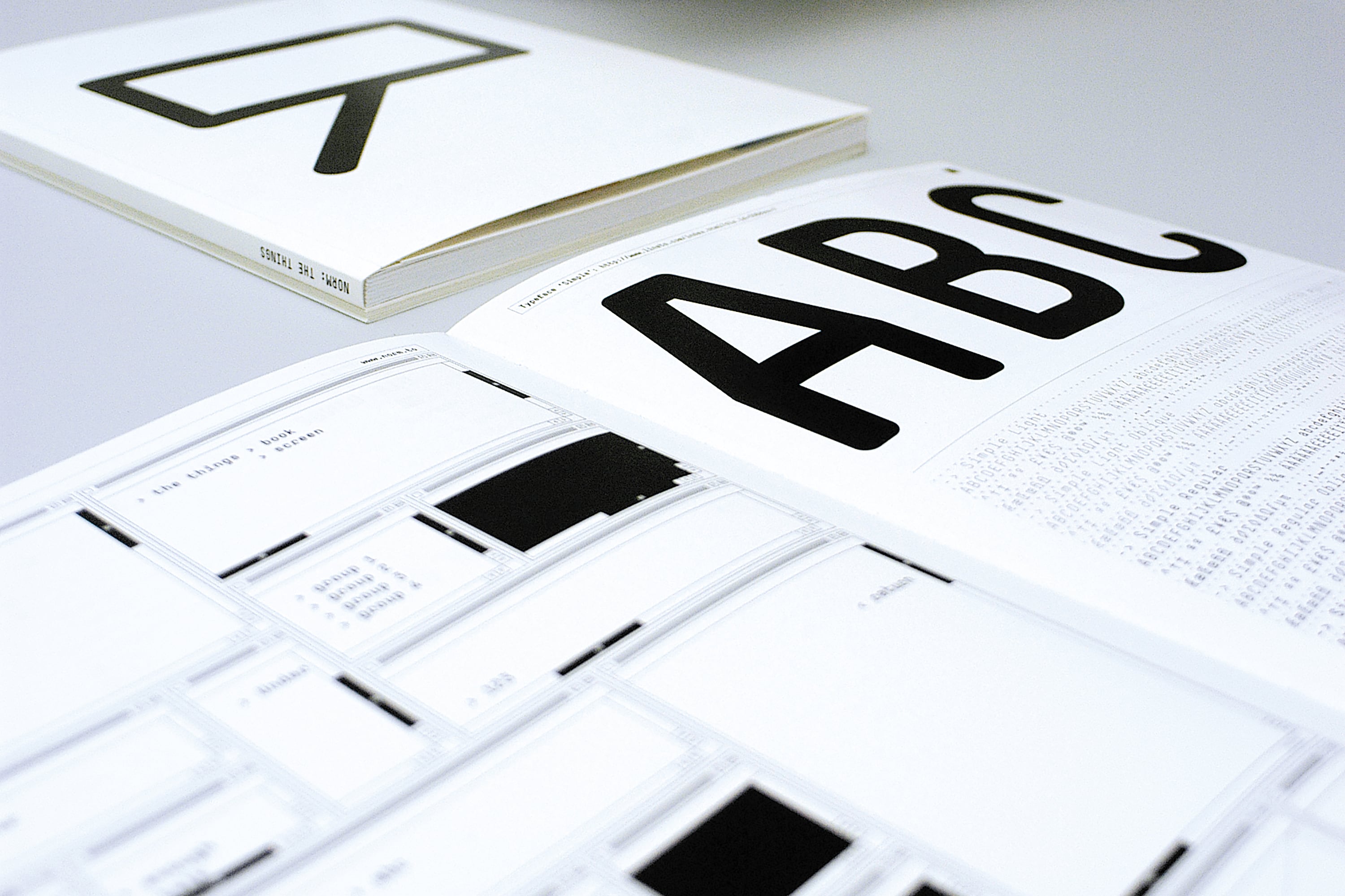
Corporate Typeface Die Schrift Siemens

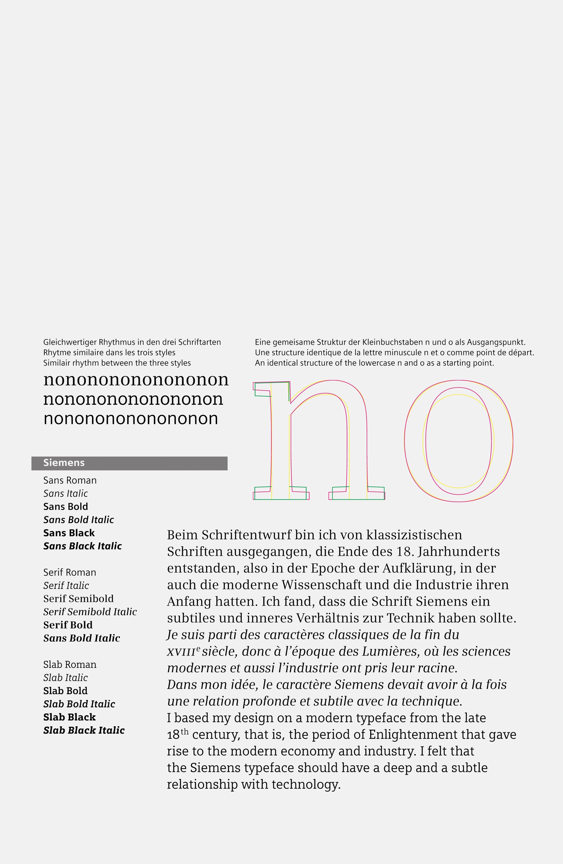
After many years of development, Siemens has settled on a new and exclusive corporate font. It is a font family that comprises three classes, the «Siemens Sans», «Siemens Serif» and «Siemens Slab», with a total of eighteen different styles as well as supplementary specialised fonts. The font establishes a corporate identity for the company throughout its worldwide operations. Digital fonts are available to cover the requirements of the wide range of media.
Comments of the nominators
This individually conceived communal project, in the tradition of Swiss typographical rationalism, reveals itself as being open to the manifold variety of our contemporary requirements in the field of textual communication.
More projects from edition 2003